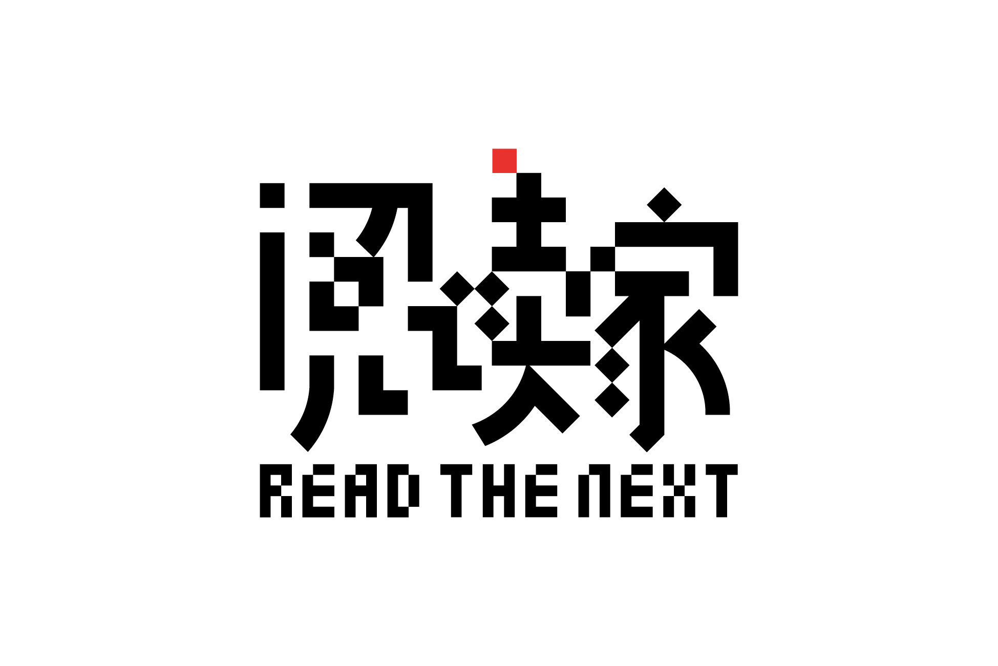
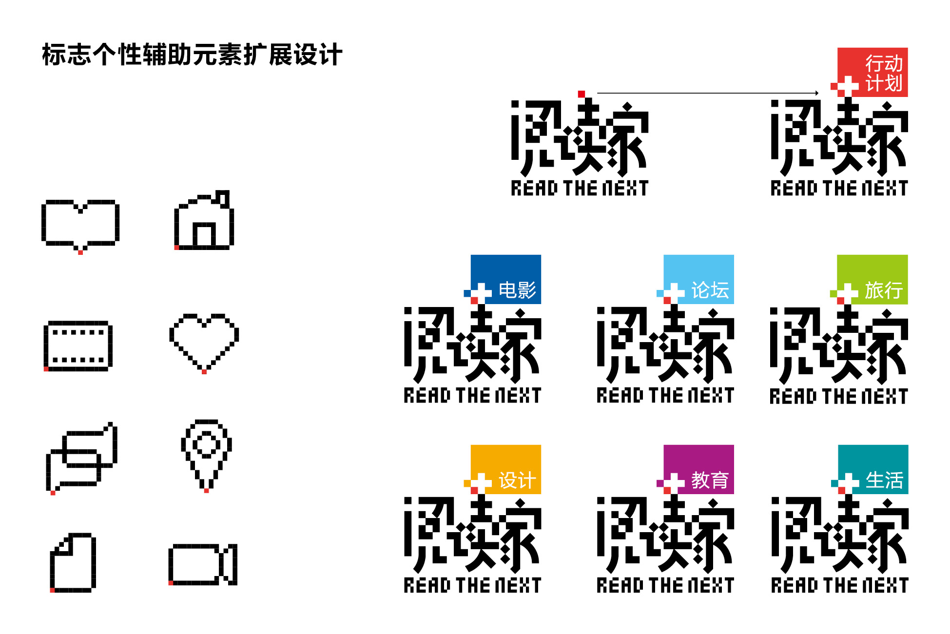
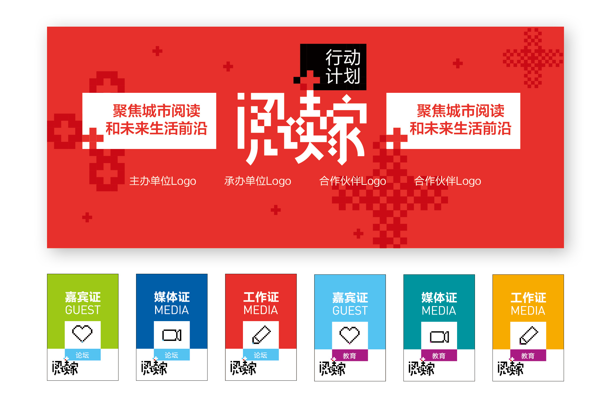
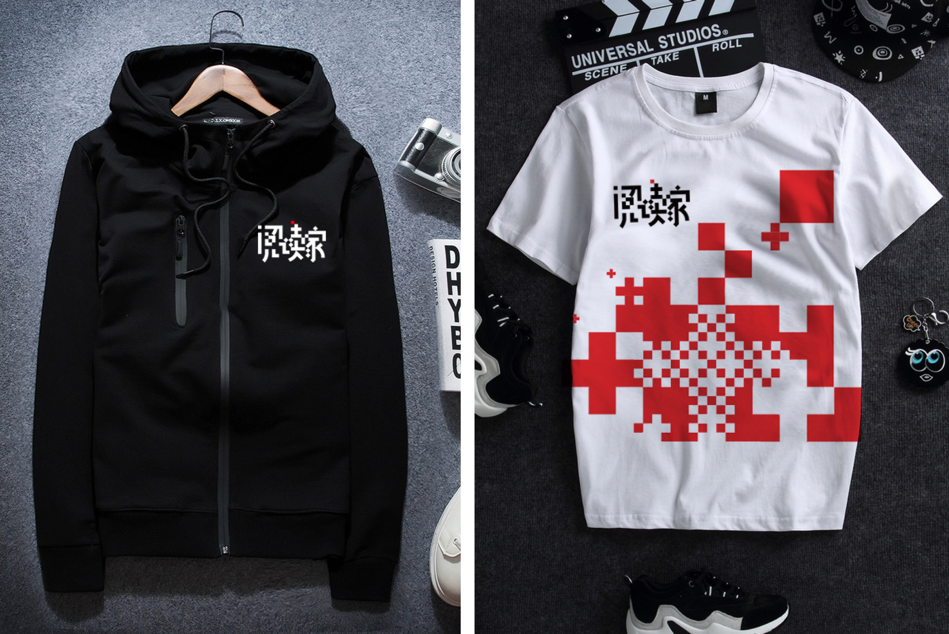
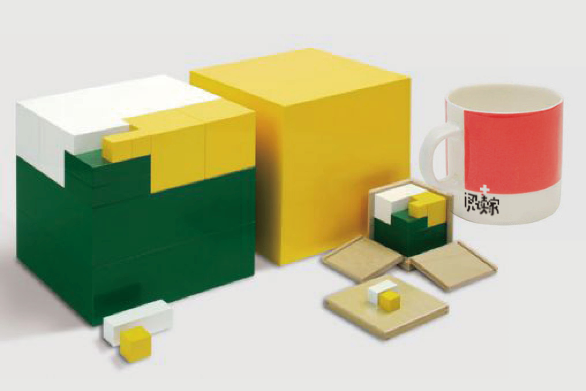
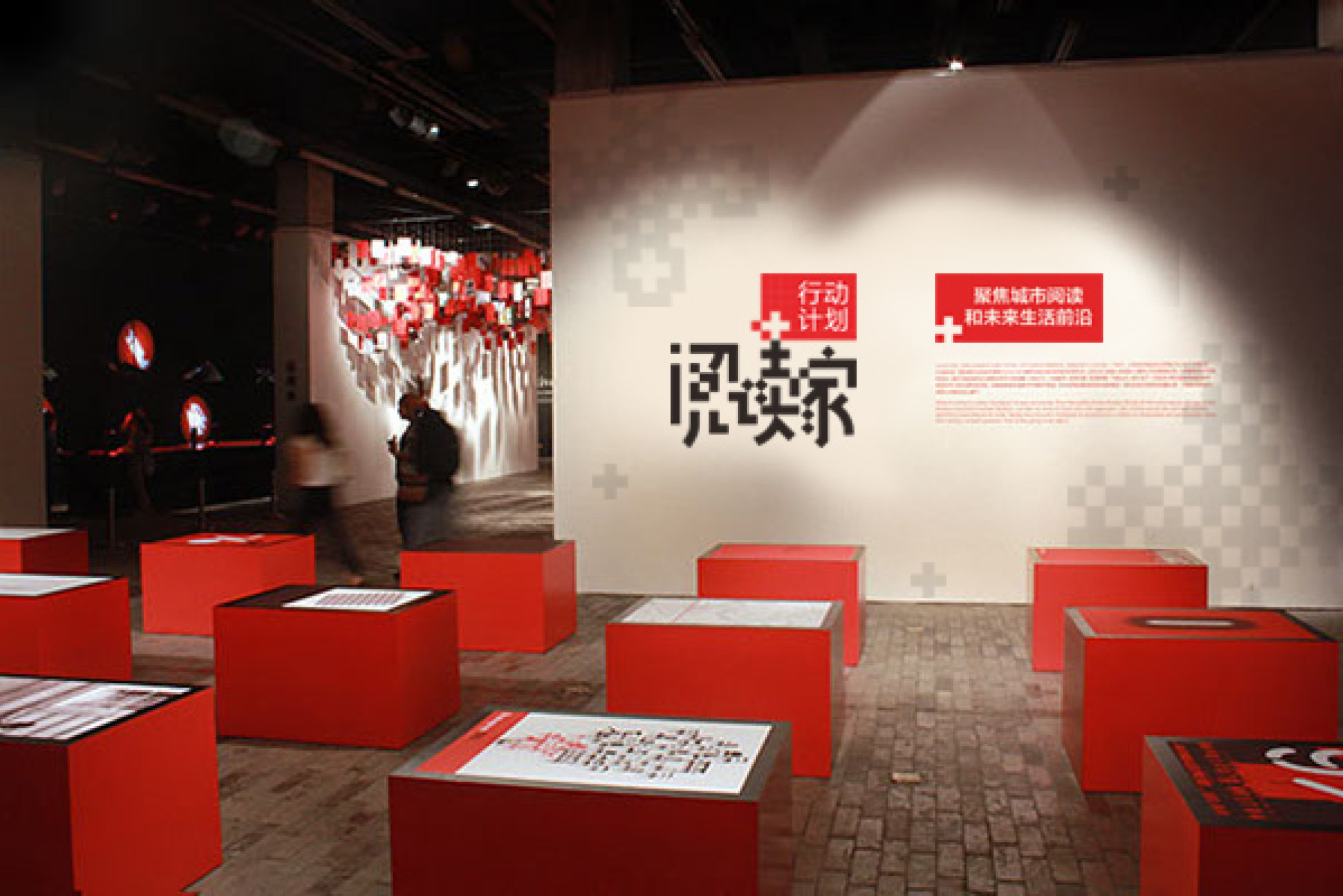
"Reader" is a platform for communication and sharing based on reading, cross-border integration of innovation in the field of humanities, discovery of independent ideas and subtle light. The logo symbolizes the independent point of view with dots (squares), and the participating individuals form the empathic group and think tank. Visually, the brand name "reader" is formed by connecting points (platform, family and Society), innovation and change, which is scattered, varied, simple, direct and easy to remember. In terms of application, it is possible to expand the brand across the border in the future, and skillfully integrate the "+" symbol into the core visual system to convey the possibility and huge energy of "reader" equal to "reading +" industrial cross-border combination, and the design shows the characteristics of "innovation", "cooperation" and "empowerment".
“阅读家”是以阅读为源起,跨界融合人文领域创新、发现独立思想、细微光芒的交流与共享平台。标志以点(方块)象征独立观点,参与个体,由个体形成共感人群,思想智库。视觉上由点联接成面(平台、家庭、社会),创变排列形成品牌名称“阅读家”, 错落有致、富有变化、简约直接、易于记忆。在应用上为品牌未来跨界扩充具有灵活多变的可能,并巧妙将“+”符号融入核心视觉系统,传达“阅读家”等同“阅读+”产业跨界结合的可能与巨大能量,设计展现出“创新”“合作”“赋能”的特性。