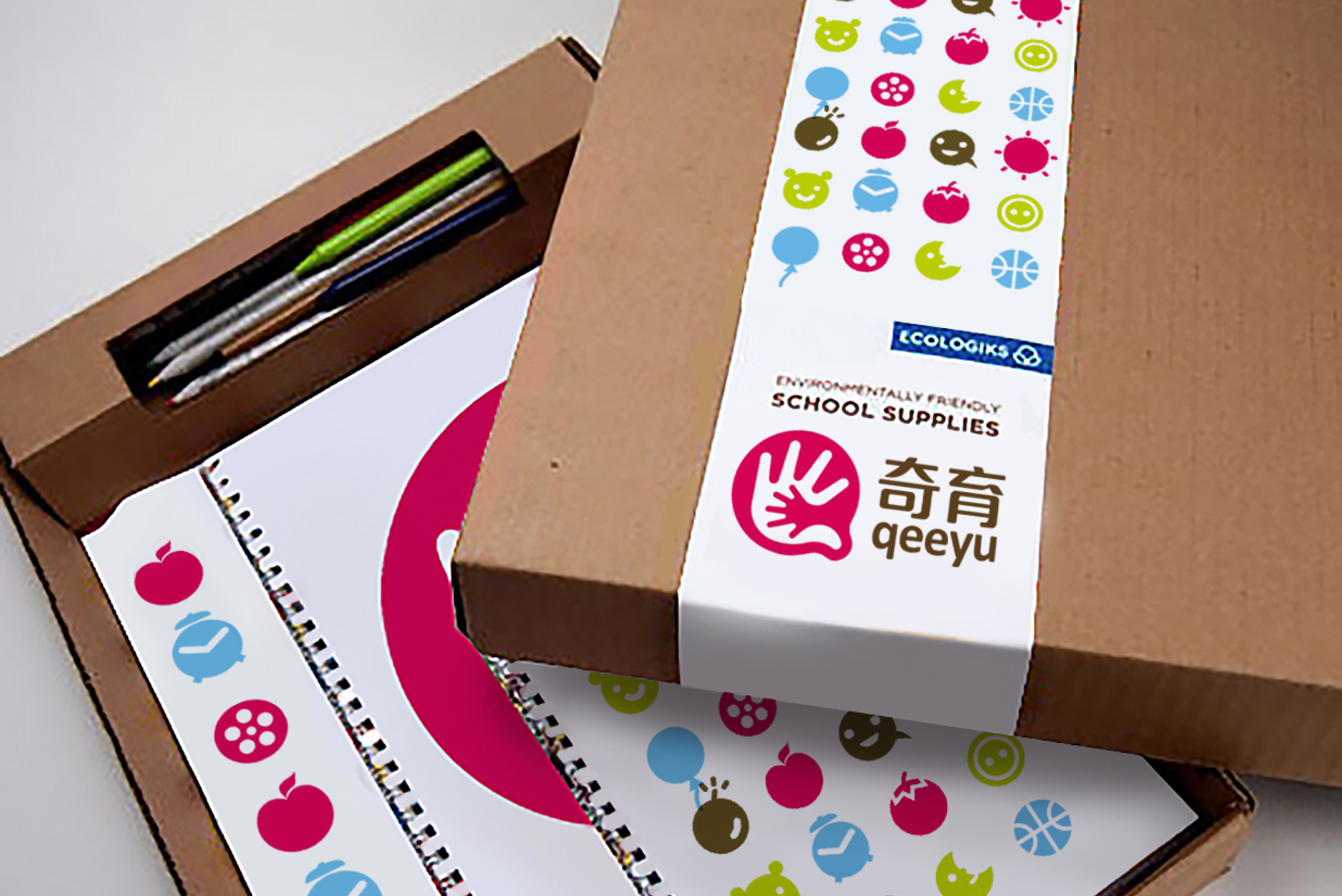
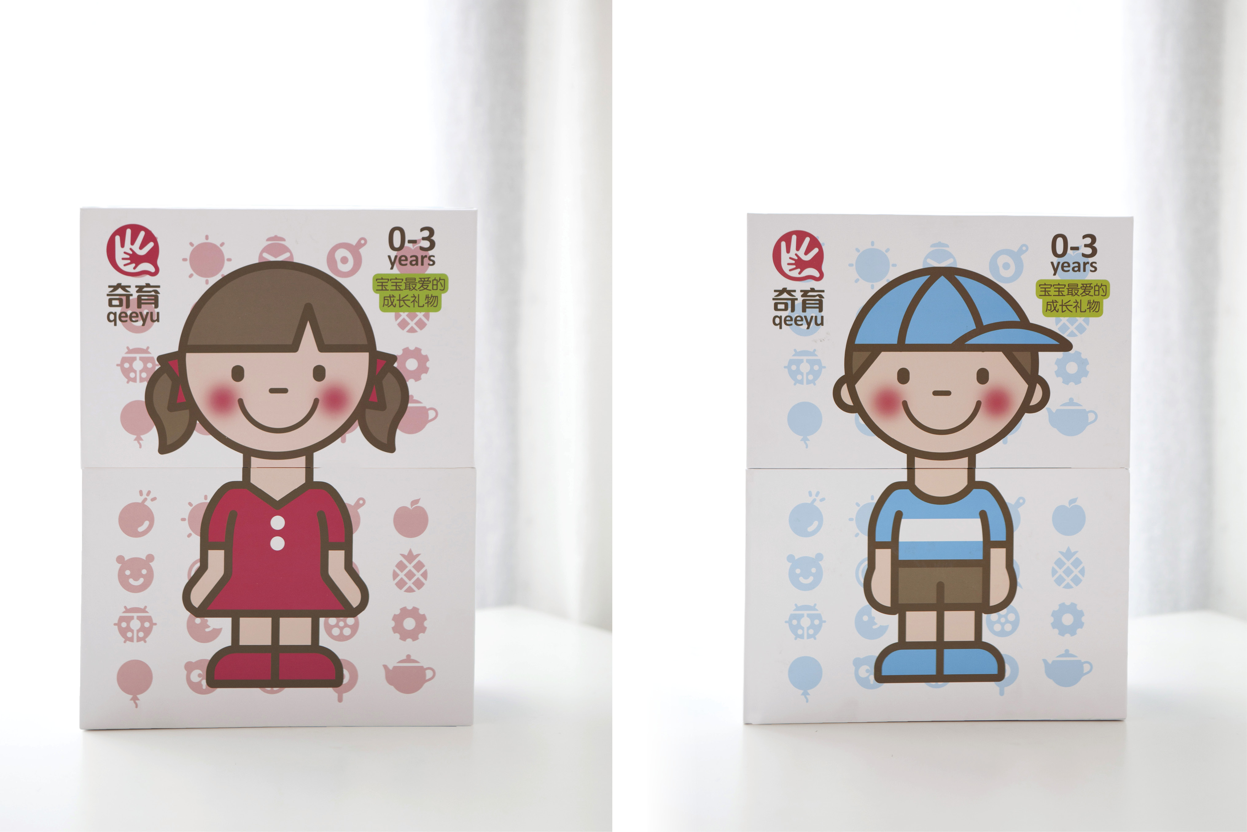
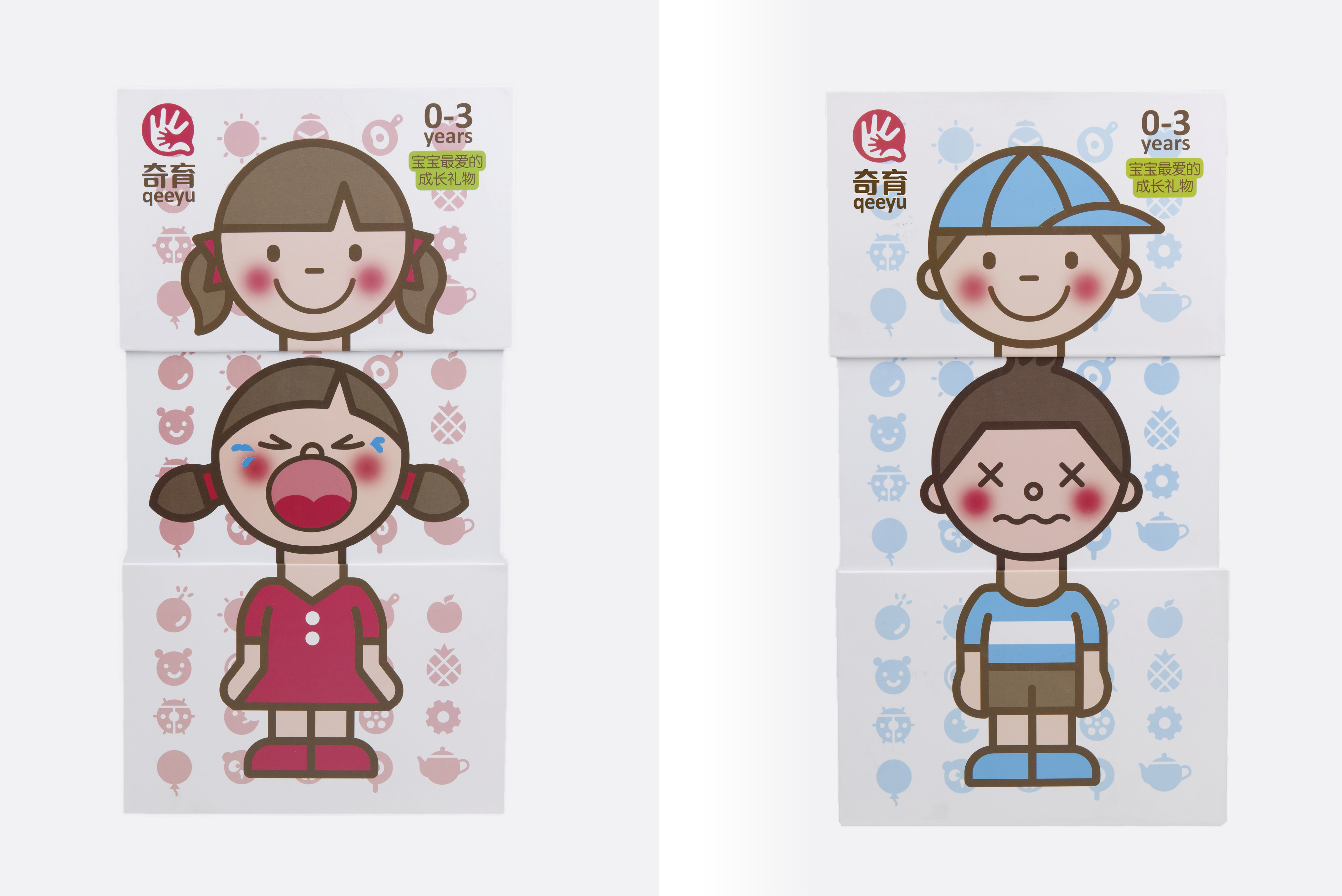
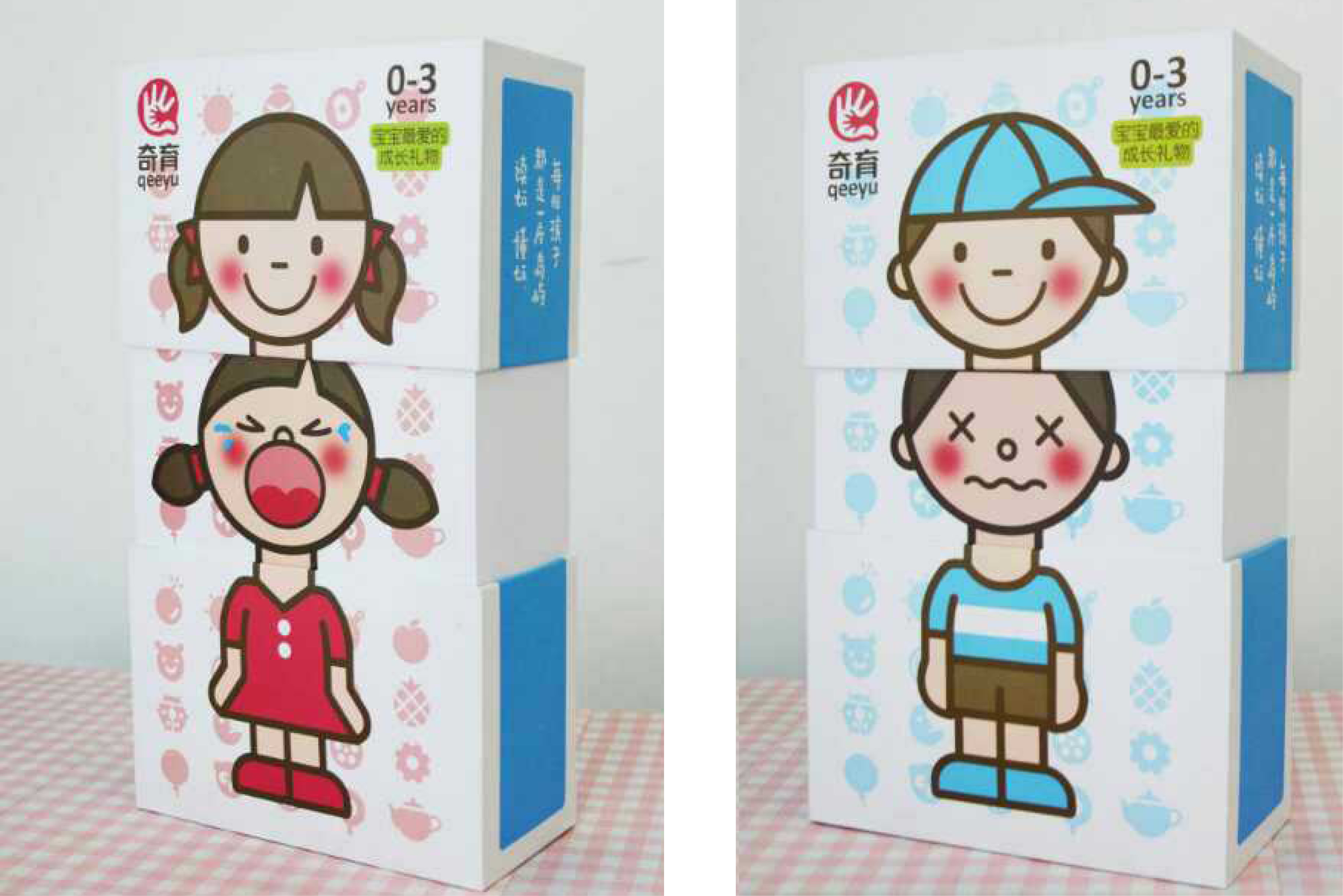
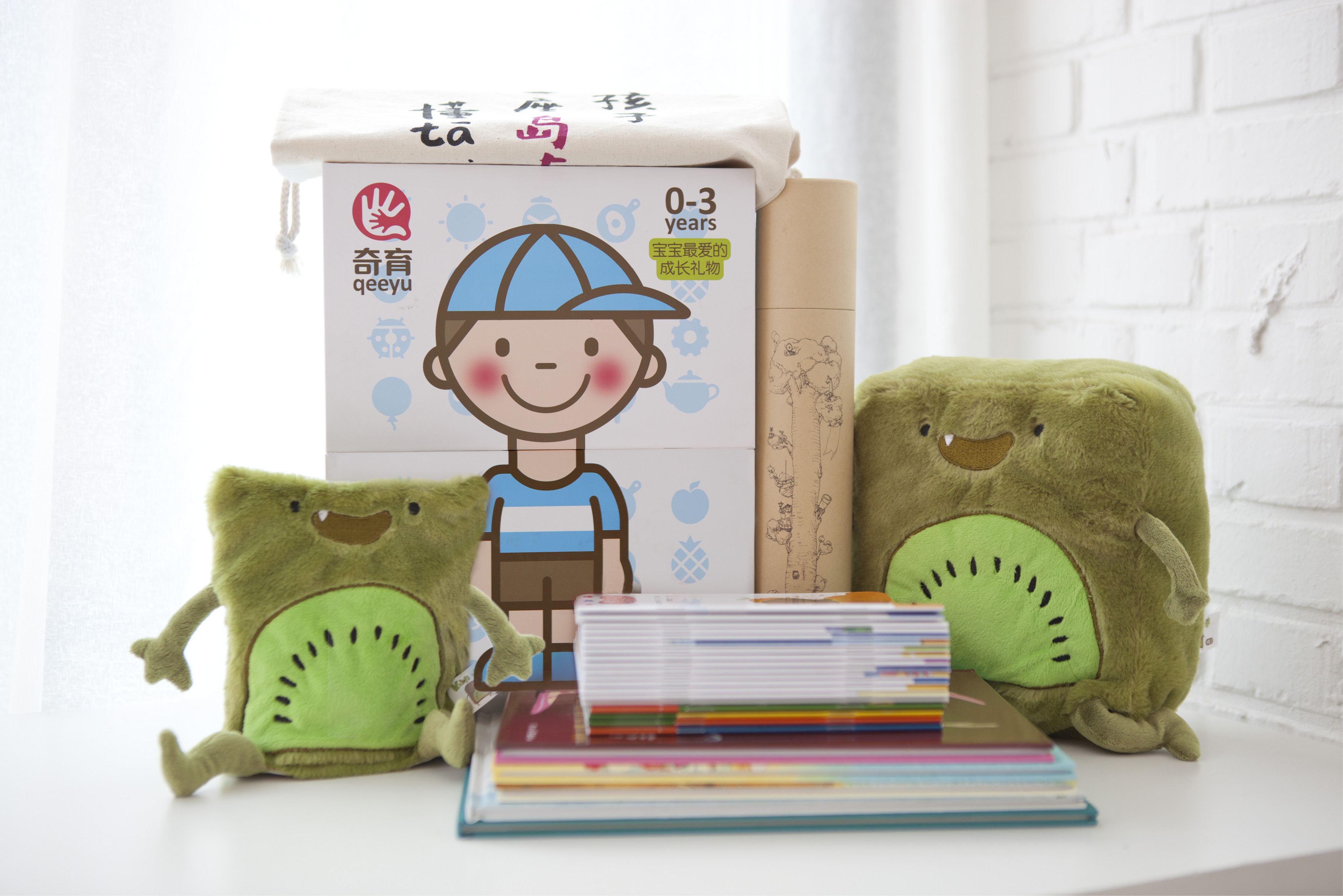
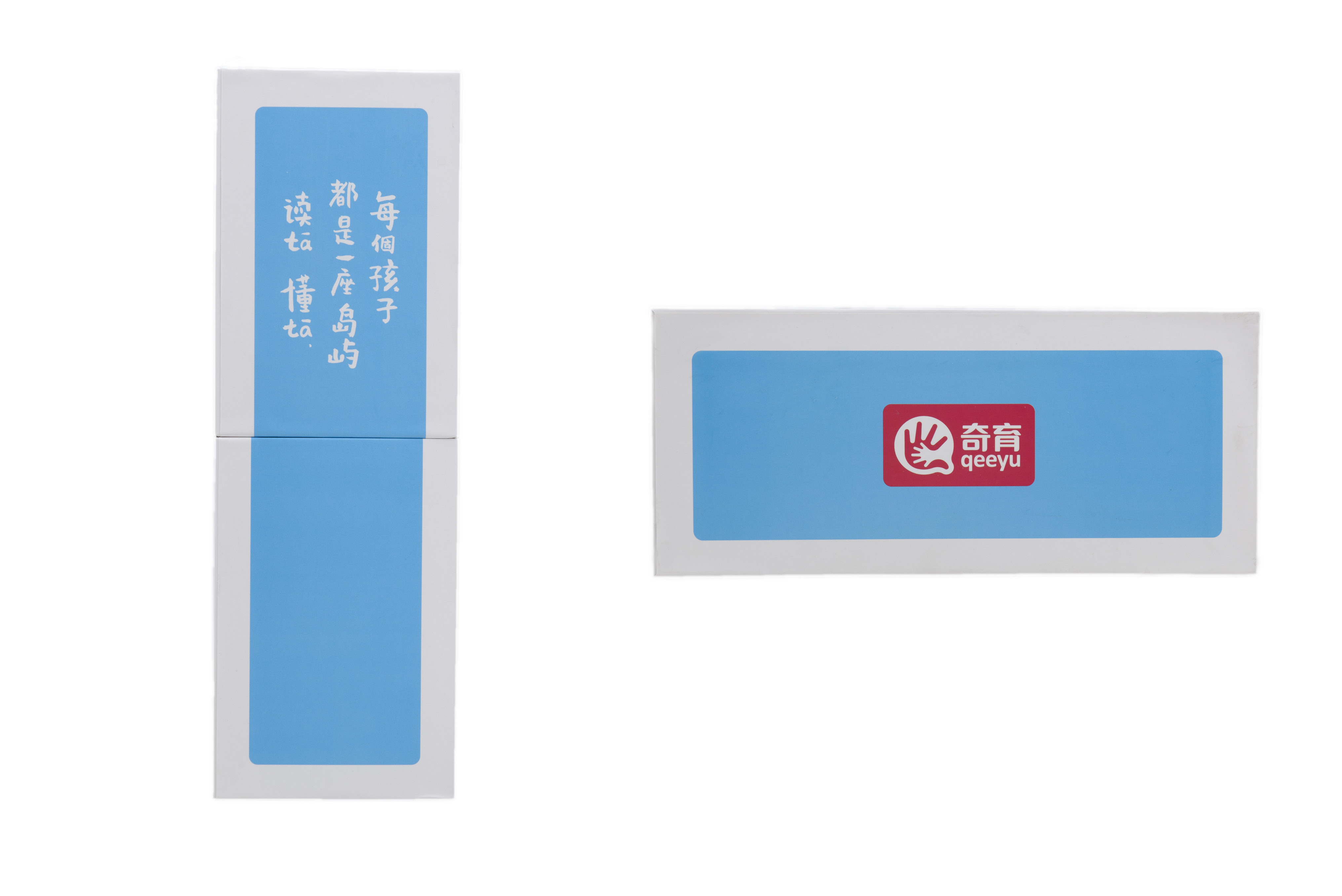
Qeeyu is a platform for sharing new knowledge in education. It shares with the new generation of parents the parenting knowledge that is informative, loving and interesting. Together with them, it provides children with high-quality family companionship, such as classic children's books, hand-made games, etc., to encourage them to become better parents.
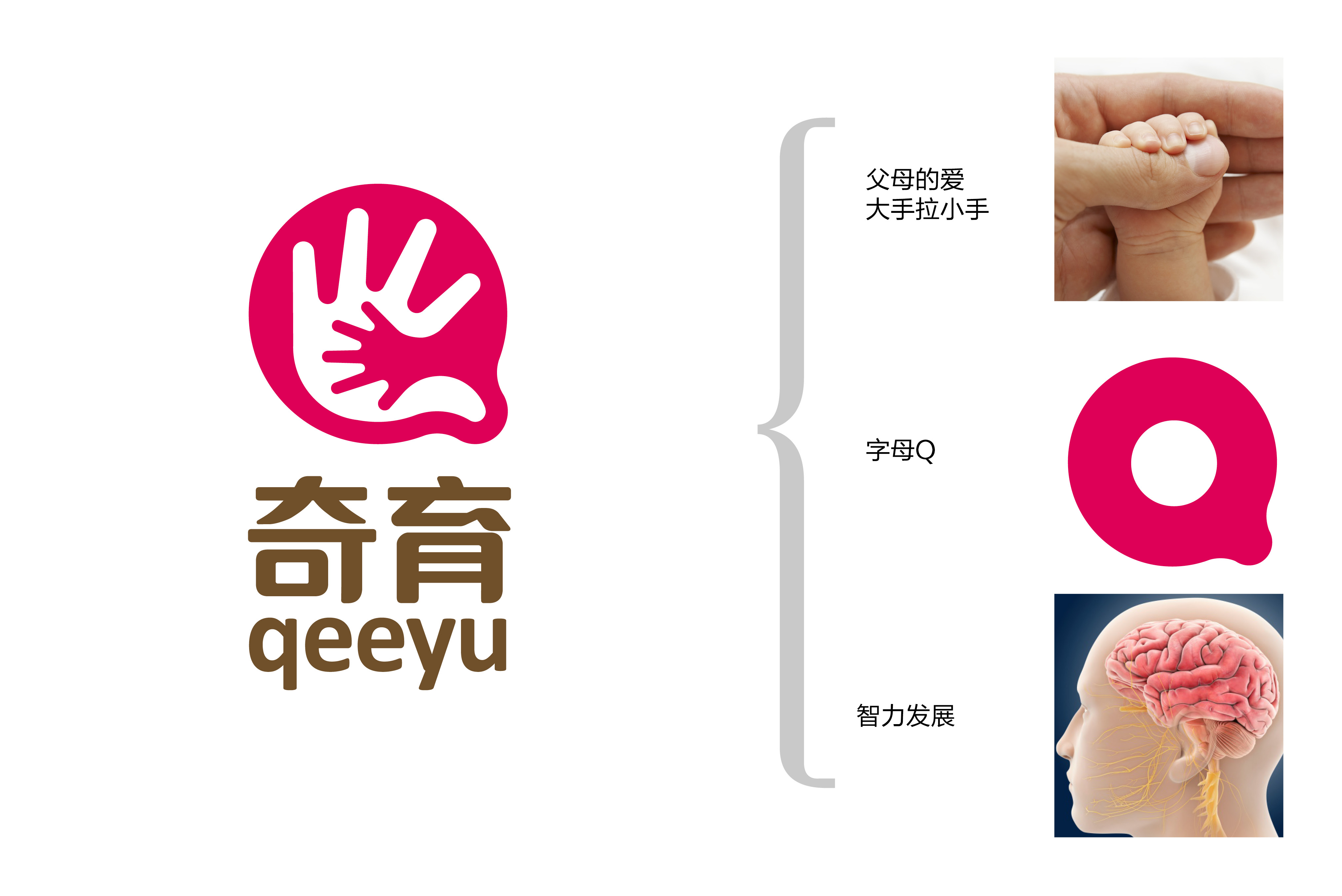
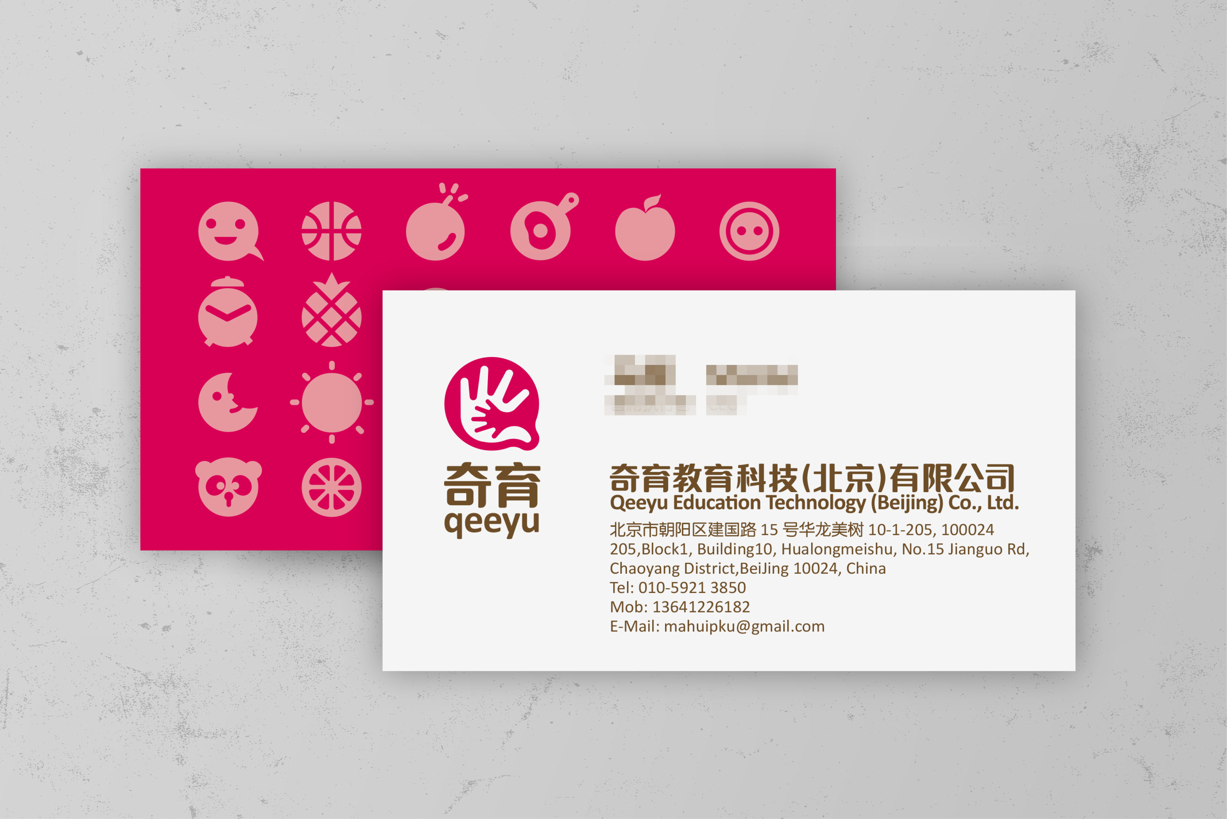
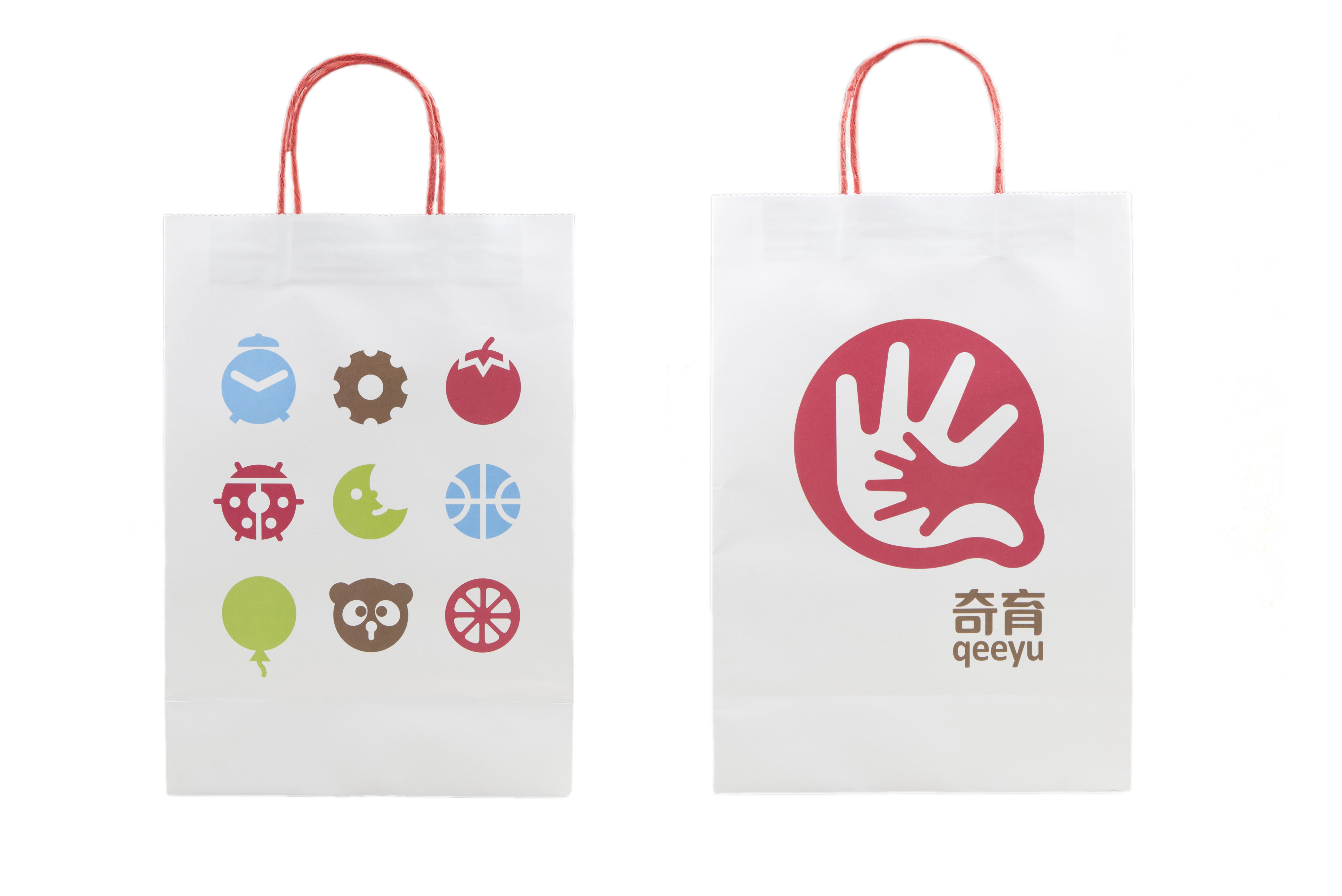
The shape of the logo adopts the capital letter Q of Qeeyu, which is simple and easy to remember. It shows the scene of parents holding their children's hands in large hands, reflects a warm atmosphere, and conveys parents' love for their children. It indicates that the whole shape is like the sulcus and gyrus in the brain, reflecting that Qeeyu promotes the development of children's mind while carrying out educational consultation.
奇育是一个教育新知的分享平台。它与新生代的爸爸妈妈一起分享有料、有爱、有趣的育儿知识,一起给予孩子高质量的家庭陪伴,如经典童书、手工游戏等,鼓励他们成为更好的父母。
标志的外形采用了奇育大写英文缩写字母Q,简单明了便于记忆。它展现父母大手拉着孩子小手的场景,体现出一种温馨的氛围,传达出父母对孩子的关爱。标志整个形态如同大脑内的脑沟和脑回,体现奇育在进行教育咨询的同时促进孩子的心智方面发展。