Client:Hachette-Phoenix Cultural Development (Beijing) Co., Ltd
客户:凤凰阿歇特文化发展(北京)有限公司
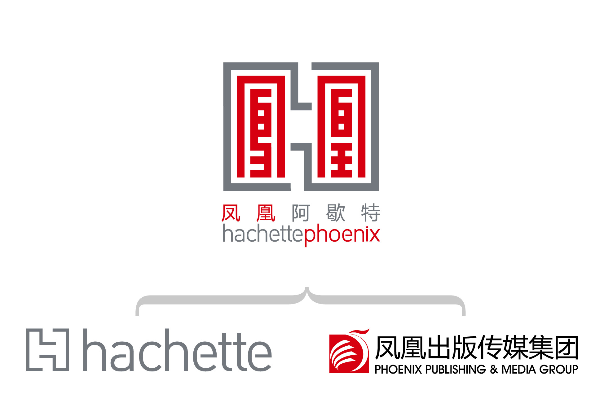
Hachette-Phoenix Cultural Development (Beijing) Co., Ltd. is a cultural consulting service and book distribution enterprise jointly established by Jiangsu Phoenix publishing & media Inc., a leading publishing company in China, and Hachette Livre Group, French publishing giant.
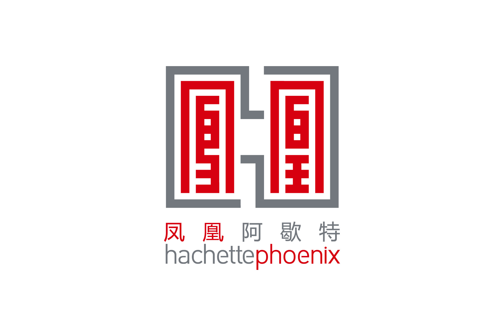
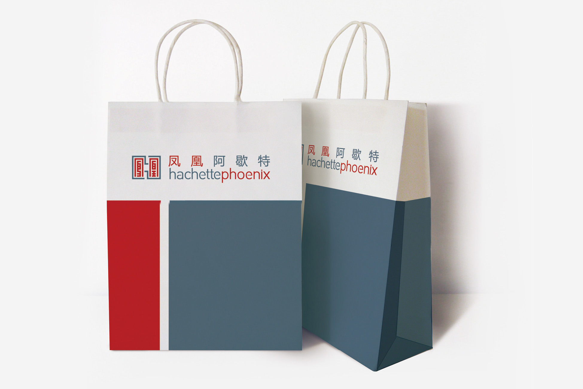
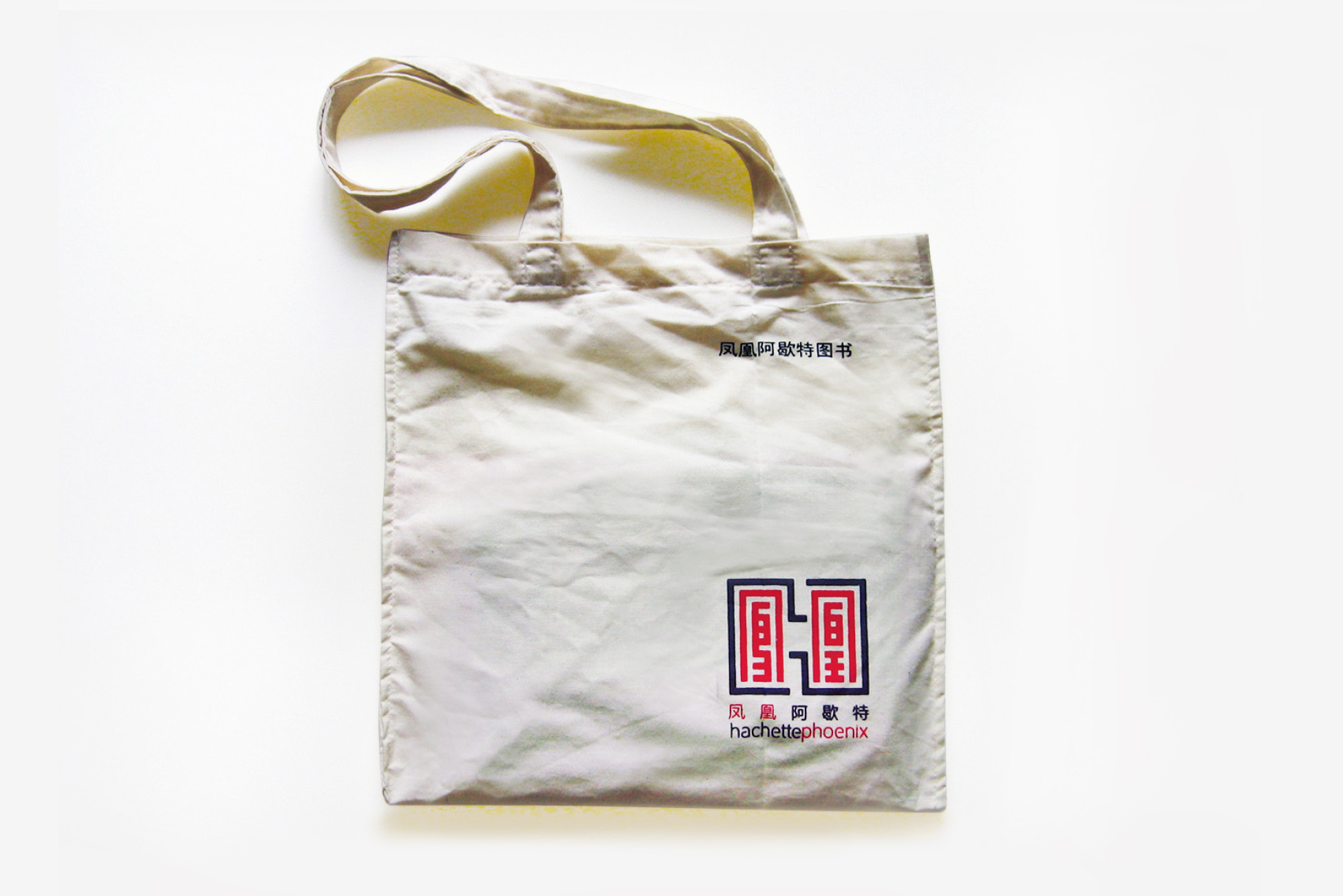
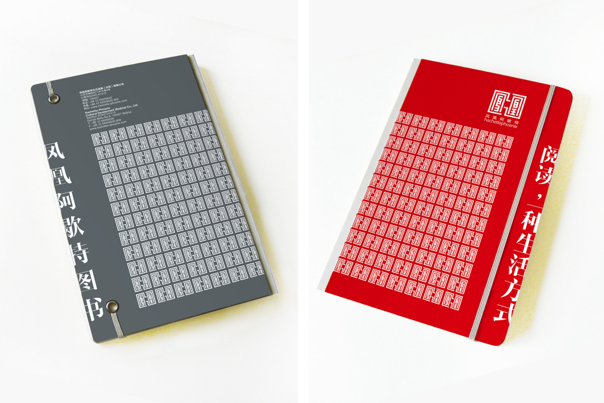
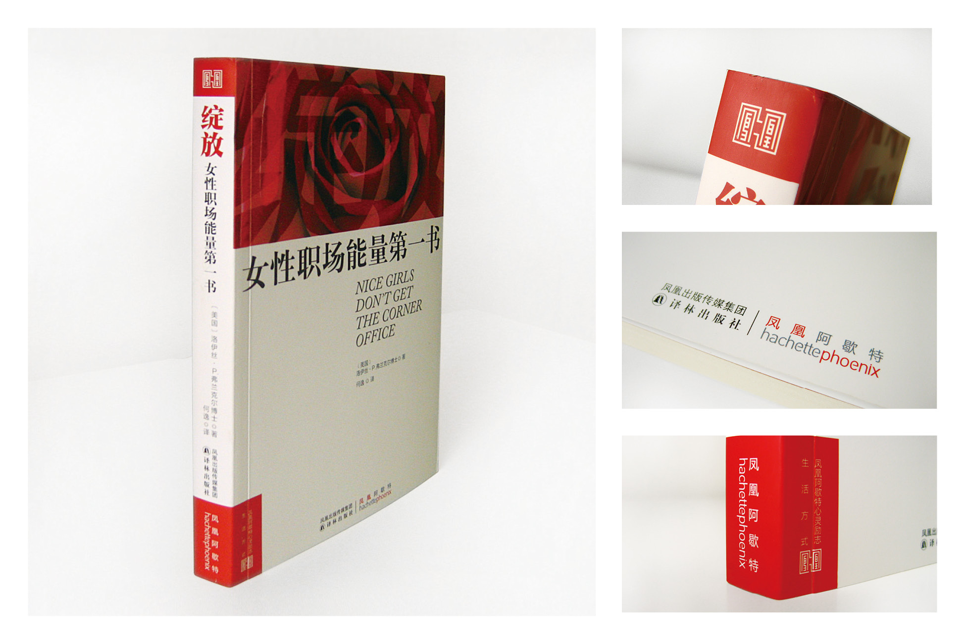
The elements of China and France should be displayed in a fair and harmonious way during the design. The icon takes the Chinese character "phoenix" in Phoenix publishing group of China and the initial letter "H" in Hachette publishing group of France as the visual information point. "H" continues to use the original design expression form of Hachette. "Phoenix" uses the seal form to echo the "H" graphic. The color of the logo consists of two colors: Phoenix's Chinese red and Hachette's dark grey. The Chinese and Western characters are combined skillfully, the graphics are integrated and unified, and they are balanced with each other.
凤凰阿歇特文化发展(北京)有限公司是由中国出版的龙头企业凤凰出版传媒集团,与法国出版巨头阿歇特图书出版集团共同创建的文化咨询服务与图书发行公司。
在Logo设计的时候须将中法双方的元素都公平和谐地展示。图标将中国凤凰出版集团中汉字“凤凰”和法国阿歇特“hachette”出版集团名称首字母“H”作为视觉信息点。“H”延用阿歇特原有设计表现形式。“凤凰”采用印章形式与“H”图形化简约设计手法相呼应。标志的色彩由两种颜色构成:凤凰的中国红和hachette的深灰。汉字与西文字母结合巧妙,图形完整统一,互为平衡。