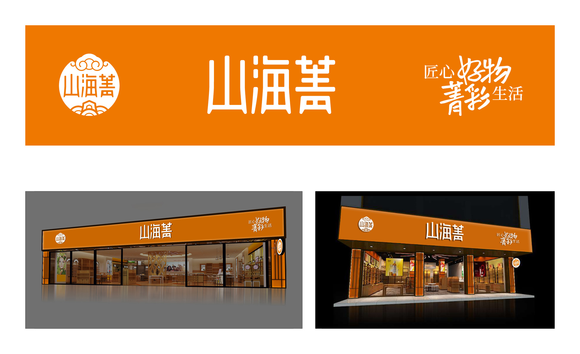
"91 TOP" is a new retail e-commerce website of Shanghai 91 TOP Household Products Co., Ltd. for urban "new youth" and "new middle-aged". It’s name originated from the first wonderful book "the book of mountains and seas". The aim is to absorb the elite and nutrients of Chinese traditional culture, combine the modern aesthetic characteristics, inherit and develop the cultural mission of Chinese style, and create a brand world belonging to 91 TOP. The visual design of 91 TOP brand is based on the theme of "not imitating the ancient but soaking in the oriental taste, not imitating the foreign and shining the spirit of the times".
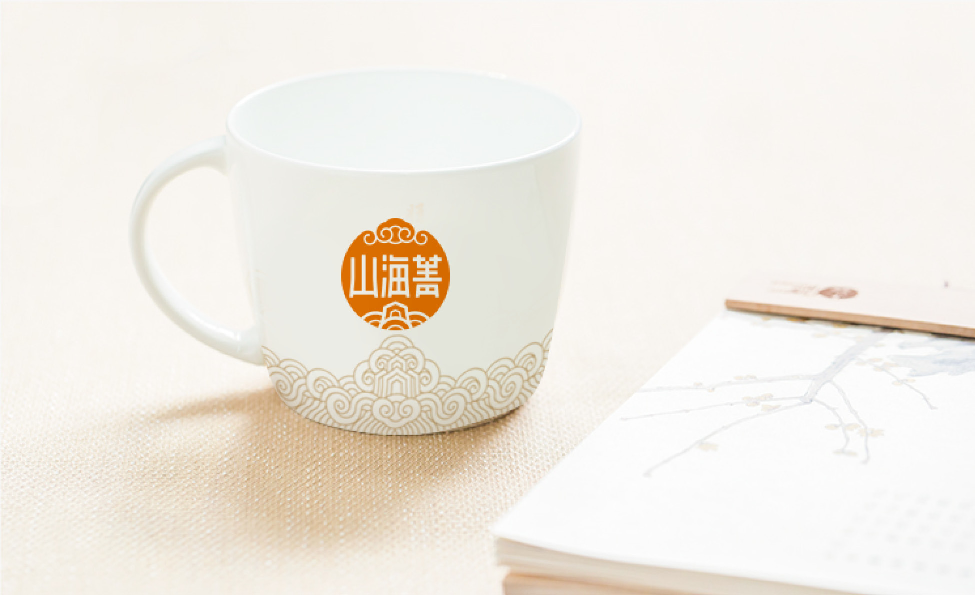
“山海菁”是上海山海菁家居用品有限公司旗下面向城市“新青年”、“新中年”的新零售电商网站。其名称缘起于千古第一奇书《山海经》。旨在吸取中国传统文化中的菁华和养分,结合现代审美特点,传承发展汉韵时风的文化使命,打造属于山海菁的品牌世界。品牌核心理念为:集匠心好物,享菁彩生活。山海菁品牌视觉设计全面围绕着“不摹古却饱浸东方品位,不拟洋又焕发时代精神”这一主旨展开。
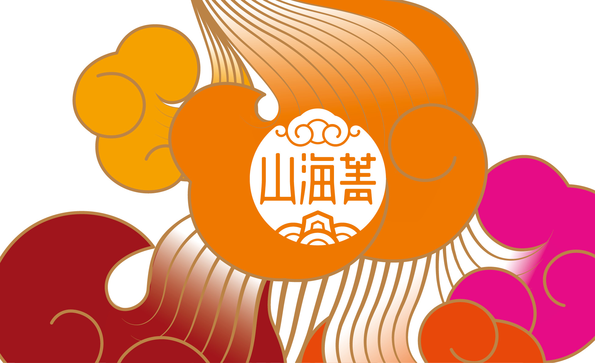
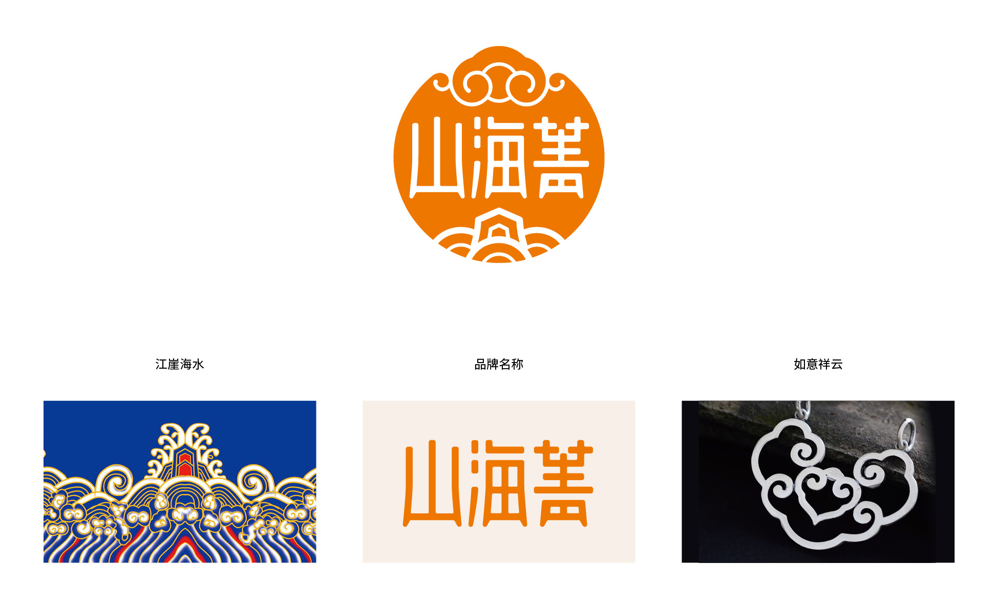
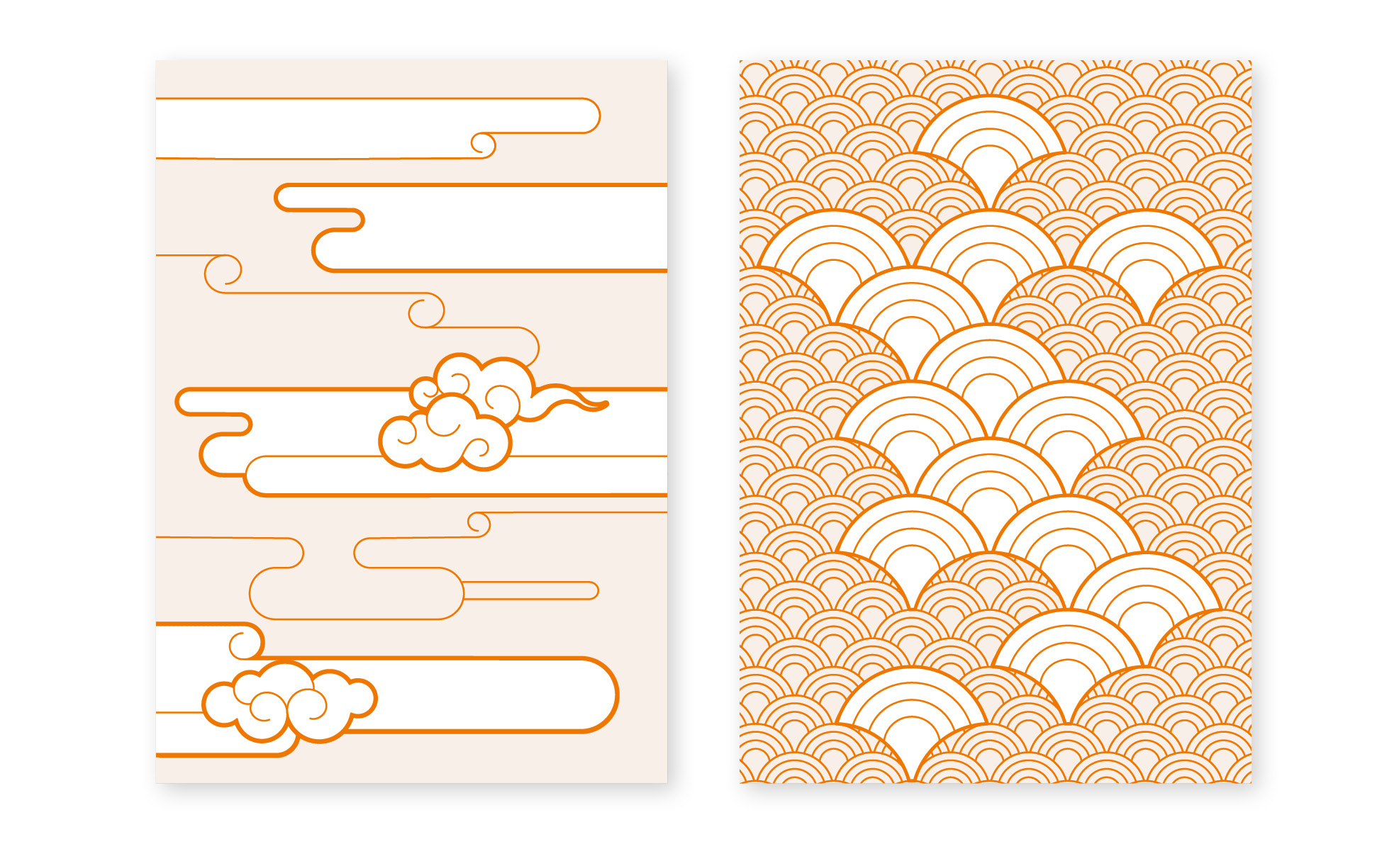
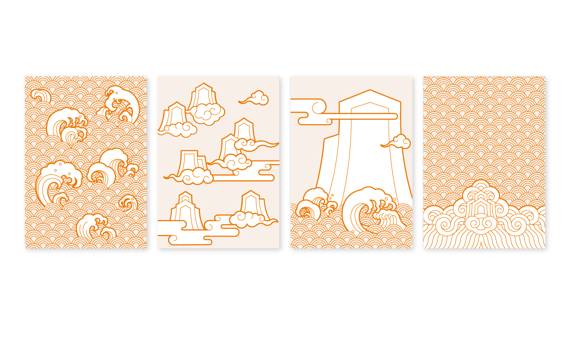
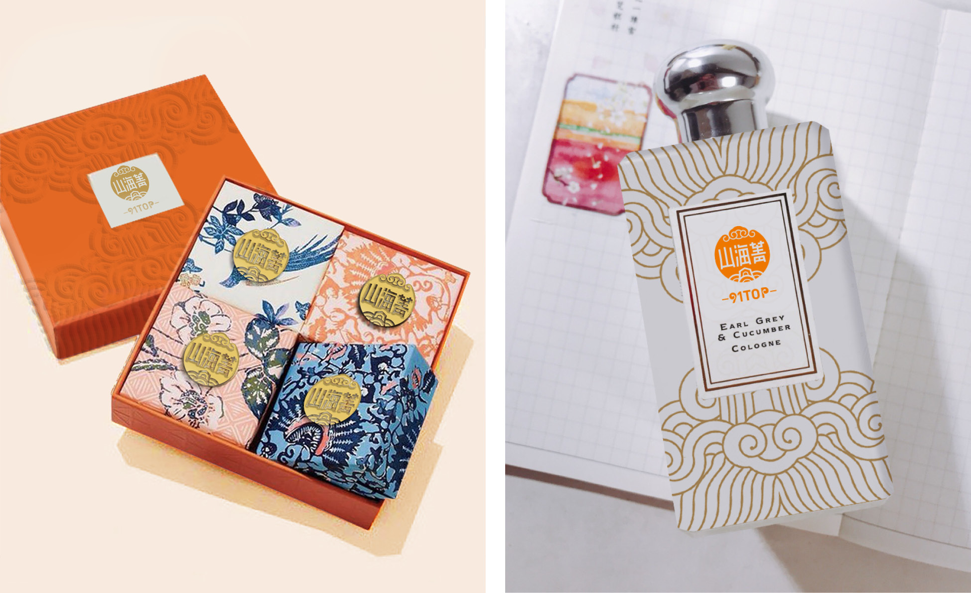
The shape of the logo is round, integrates with the traditional Chinese pattern of River Cliff Seawater and Auspicious Cloud and Ruyi, and added the brand name "山海菁". River Cliff Seawater pattern is a kind of Chinese traditional pattern, that is, under the pattern, there are curves representing the deep sea. Here it is called the water foot. The water foot are decorated with rolling waves, standing rocks, and auspicious clouds. This pattern is often decorated at the bottom of the ancient official uniforms or dragon robes, which means longevity, continuity, or unity of mountains and rivers, and peace.
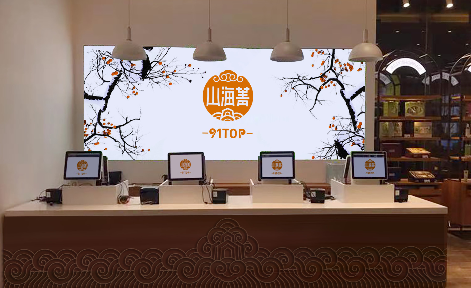
The logo color is pure orange, which gives people a warm feeling. At the same time, there are fashion, youth, dynamic and a feeling of vitality.
标志形态为圆形,圆形中融入中国传统纹样江崖海水纹和祥云如意纹样,并加入了品牌名称“山海菁”字样。江崖海水纹是一种传统纹样,即图案下方排列着代表深海的曲线,这里被称为水脚,水脚上装饰有波涛翻卷的海浪,挺立的岩石,并有祥云点缀,这种纹样经常饰于古代官服或龙袍的下摆,寓意福山寿海,绵延不断,或山河一统,万世升平。标志色彩为单纯的橘红色,橘红色给人温馨的感觉。同时也有时尚,青春,动感,有种让人活力四射的感觉。
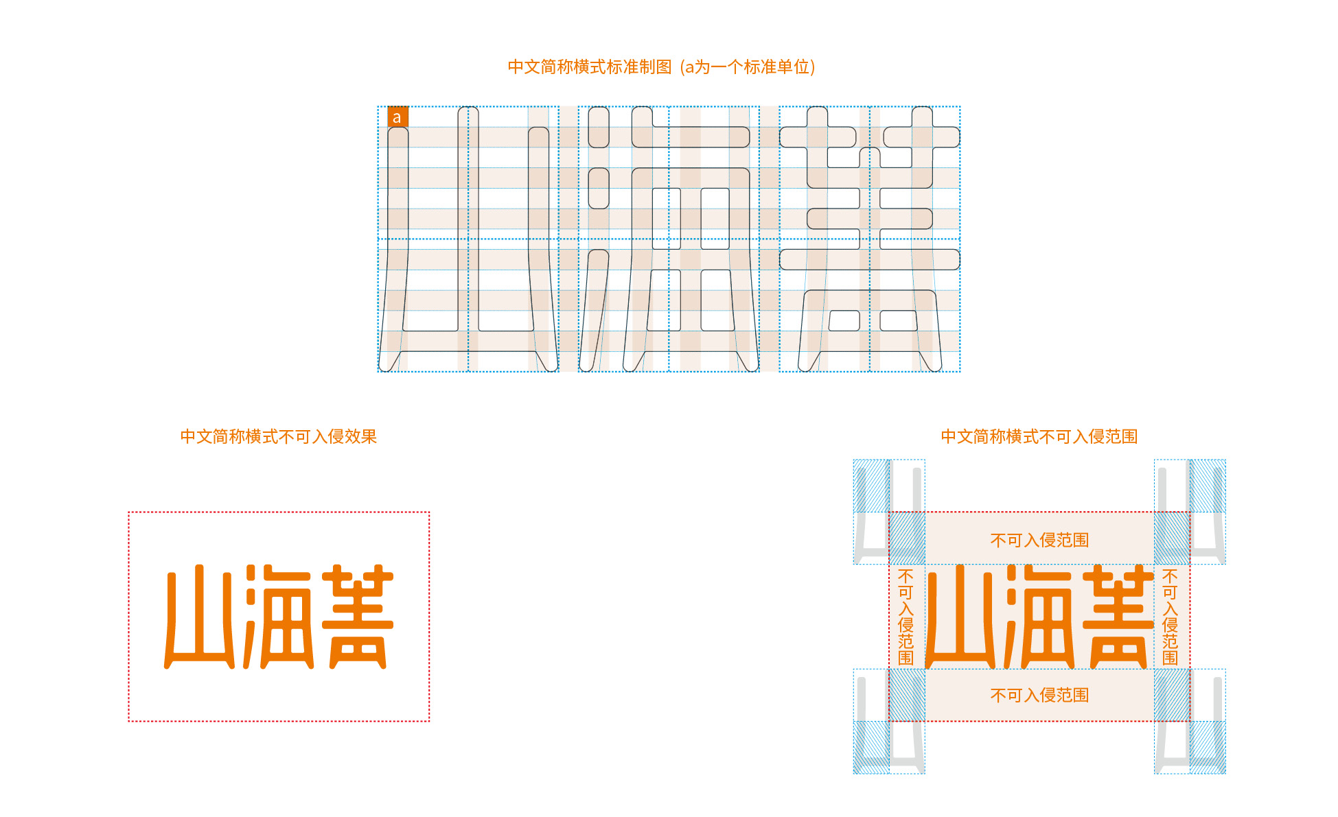
The Chinese standard font of "山海菁" has been specially designed with rounded strokes; the left and right sides of the lower half are slightly turned outwards, which corresponds to the shape of "山" in the logo, and at the same time, it looks like the shape of " tripod" of ancient Chinese vessels; finally, the corner of the cone is also processed at the foothold. The whole figure is stable and dignified, not clumsy, beautiful and harmonious, tall and straight.
“山海菁”的中文标准字体经过特别设计,字体笔画细节倒圆角;下半部分左右两边微微向外撇,与标志中“山”的造型相呼应,同时又形似中国古老器具“鼎”的造型;最终落脚处还做了锥角的处理。整个字形稳重端庄而不笨拙、圆融俊秀而筋骨挺拔。
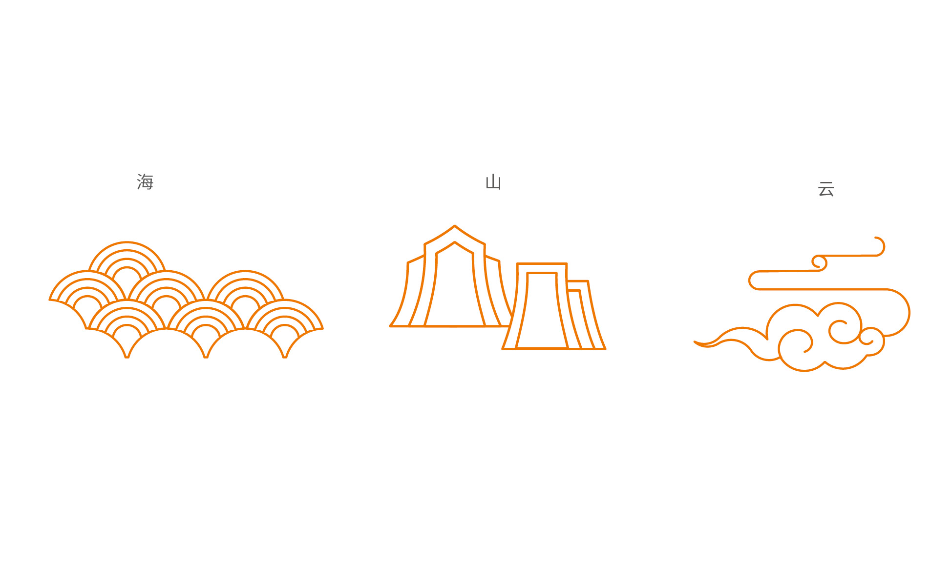
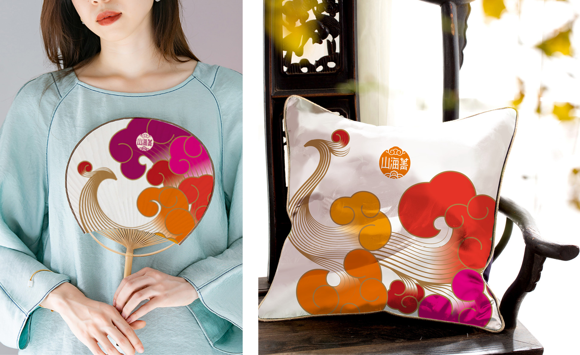
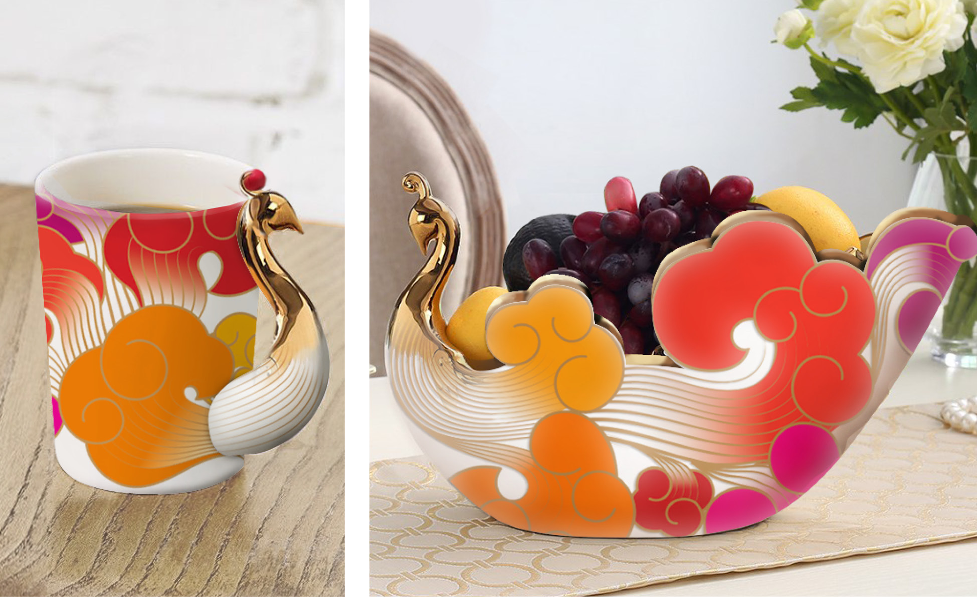
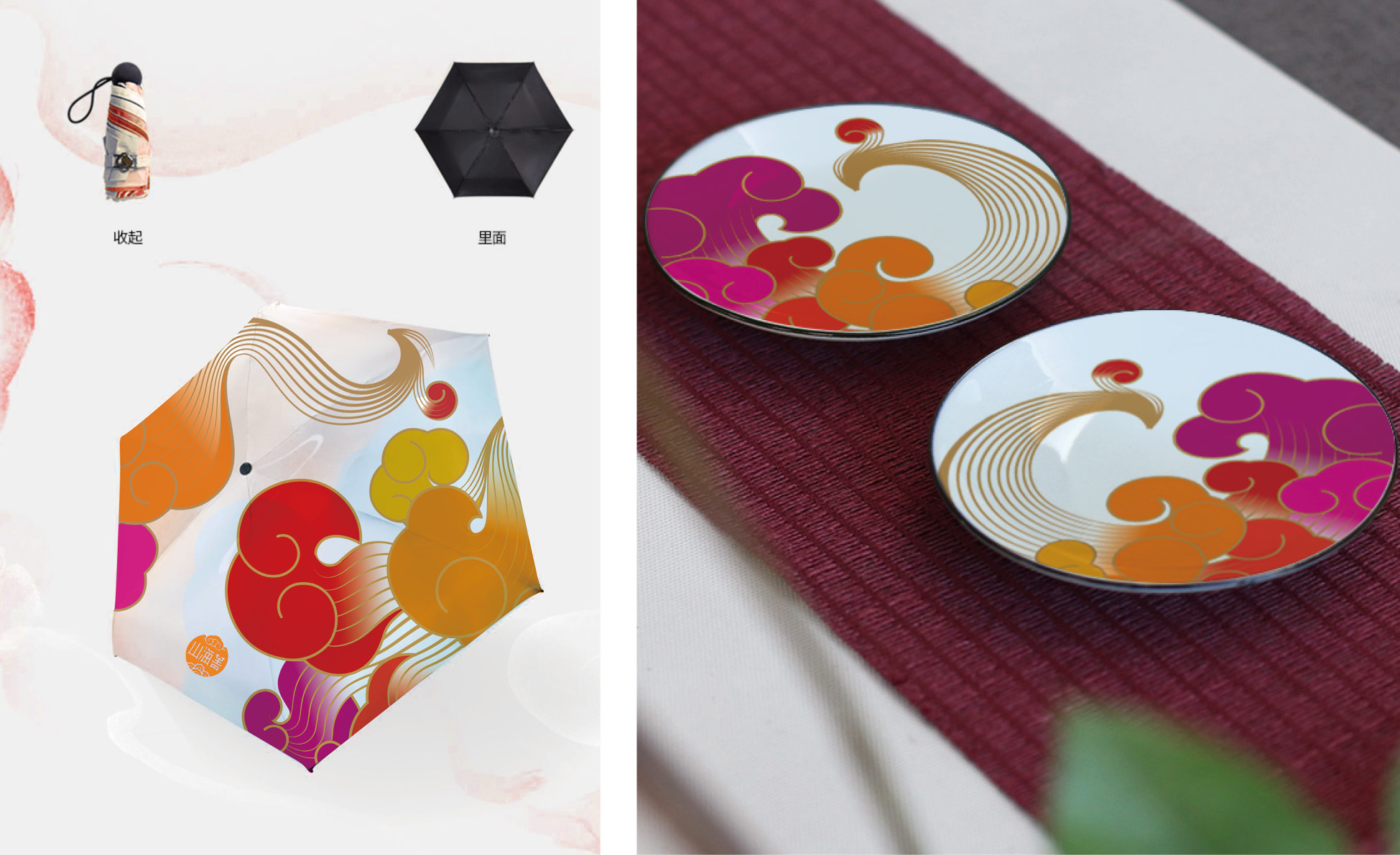
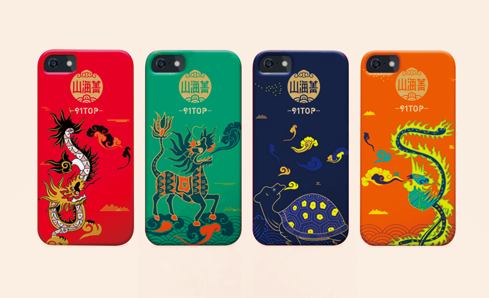
Additionally design elements are the expansion of brand vision. Through the deconstruction and combination of the mountain, sea and cloud elements in the traditional Chinese patterns (River Cliff and Seawater patterns, Auspicious Cloud patterns and other elements) in the brand logo, combined with the modern aesthetic characteristics, the unique layout style is established, the persistent craftsmanship. The persistent craftsman spirit is demonstrated.
辅助图形和辅助图案是品牌视觉的拓展。通过对品牌标志中中国传统纹样(江崖海水纹、祥云纹等元素)中的山、海、云元素重新解构和组合,结合现代审美特点,建立独特的版面风格。彰显山海菁持之以恒的工匠精神。

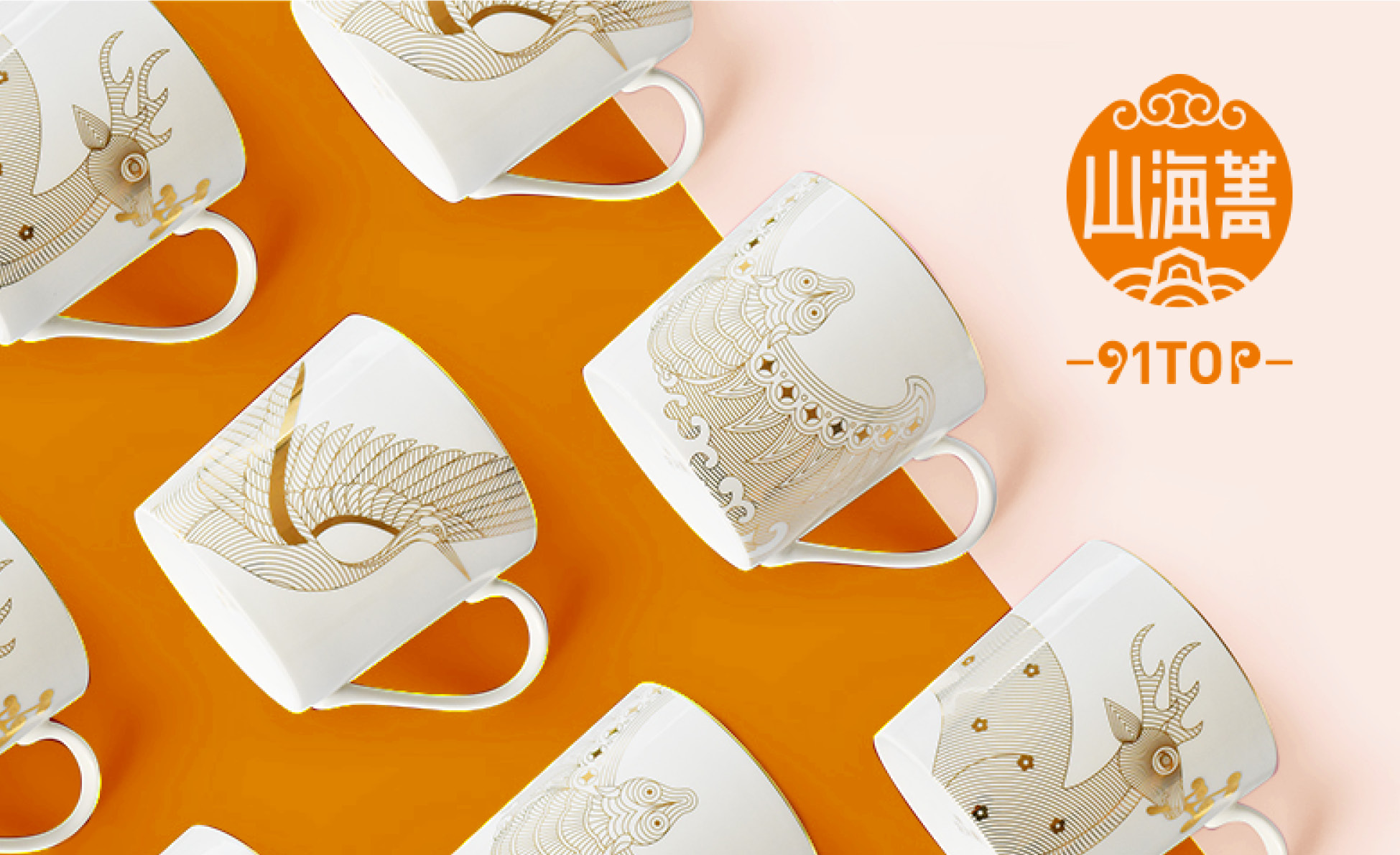
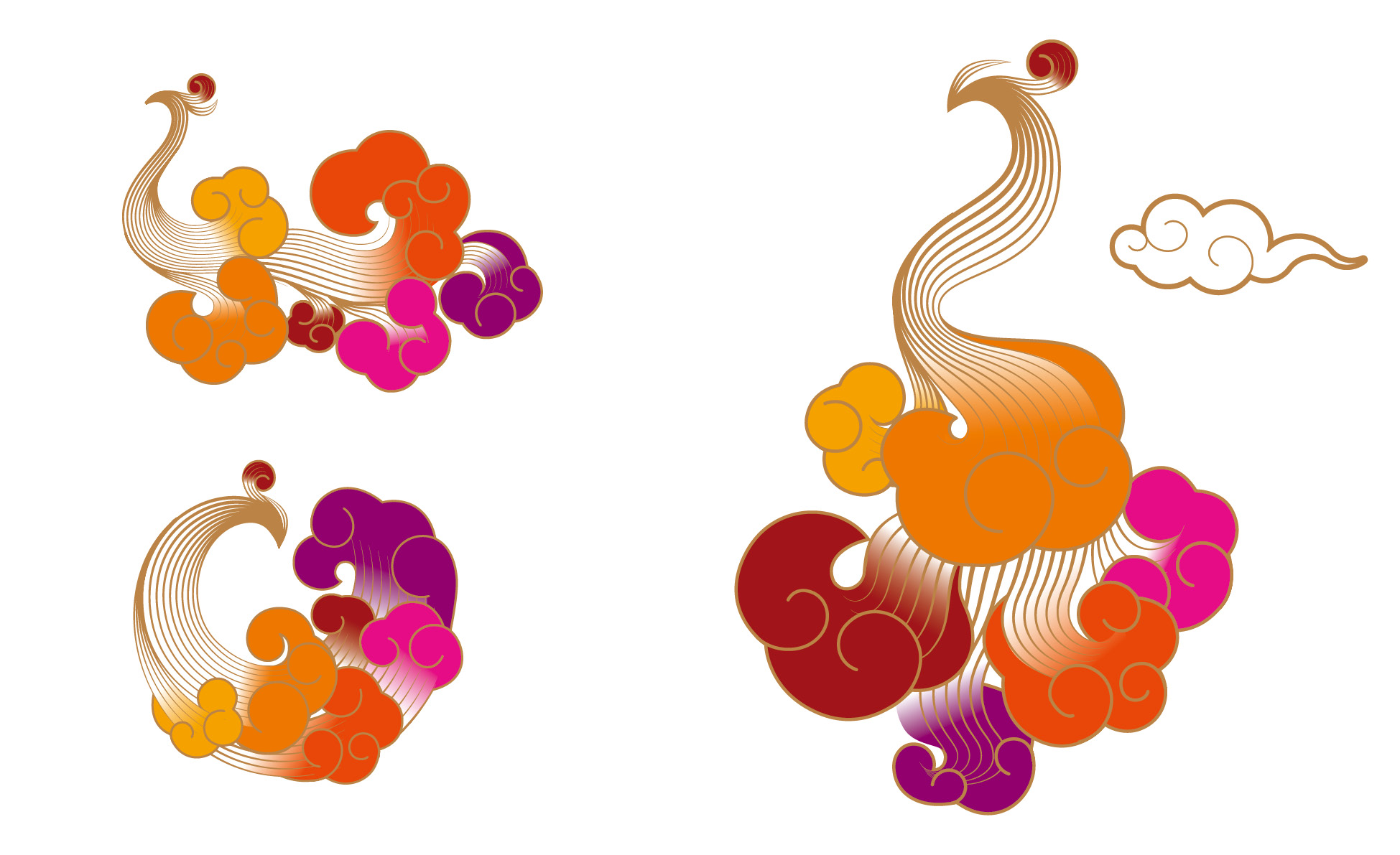
The mascot image is the Phoenix in the legend of "Mountains and Seas". The phoenix feather extracts the Ruyi and Auspicious Cloud element in the logo, which is modern and full of oriental charm, magnificent and light.
辅助形象为《山海经》传说中的凤凰神鸟。凤凰羽毛提取标志中的如意祥云的元素,现代而富有东方韵味,华丽轻盈。